
Before you can significantly boost your website’s conversion rate, you must first become a digital detective. Effective conversion rate optimization (CRO) isn’t about guesswork or randomly testing button colors; it’s about a methodical investigation to uncover the psychological friction points and technical roadblocks that are silently convincing visitors to leave. Think of it as performing a root cause analysis for your bounce rate.
Why Your Website Visitors Aren’t Converting

Most underperforming websites don’t suffer from a single, catastrophic flaw. Instead, they’re usually leaking conversions through a dozen small, overlooked issues that, when combined, create a frustrating, untrustworthy, or confusing user experience.
Your website is a pipeline, and every point of friction—from a slow-loading image to an ambiguous headline—is a tiny hole where potential customers are slipping through. Your objective is to identify and methodically patch these leaks.
Pinpointing Your Conversion Killers
The foundational step in turning performance around is a comprehensive diagnostic audit. This requires setting aside your internal biases, adopting the mindset of a first-time visitor, and uncovering the hidden roadblocks sabotaging your conversion goals.
Having analyzed hundreds of websites, I can confidently say the most common conversion killers almost always fall into these categories:
- A Muddled Value Proposition: A visitor lands on your homepage and their immediate, subconscious question is, “What’s in it for me, and why should I choose this over the alternatives?” If your content doesn’t answer that question with crystal clarity within three seconds, they’re gone.
- Example: A SaaS company’s homepage says “Next-Generation Workflow Automation.” An expert would rephrase this to “Stop Wasting 10 Hours a Week on Repetitive Tasks. Automate Your Admin in Minutes.” The second version is specific, benefit-driven, and immediately understandable.
- Decision Paralysis (Hick’s Law): Presenting too many choices without clear guidance overwhelms users. An e-commerce store with 50 visually similar products and no filtering options is a classic example. An overwhelmed visitor defaults to inaction—they don’t buy.
- Premature Commitment: Asking for too much information, too early in the relationship, destroys trust.
- Example: A local contractor’s contact form demanding the user’s full project budget, address, and phone number just to ask a simple question. This feels invasive. A better approach is a simple form with “Name,” “Email,” and “How can we help?” followed by a more detailed questionnaire on the thank-you page or during a follow-up call.
- High User Friction: This is a catch-all for anything that makes using your site a chore. We’re talking about slow load times, a confusing navigation menu, form fields that don’t work on mobile, or a checkout process with excessive, unnecessary steps.
Key Takeaway: A high bounce rate is merely a symptom. Instead of treating the symptom (e.g., changing a CTA button color), you must diagnose the underlying disease (e.g., a visitor who fundamentally doesn’t understand your offer or trust your website). To dive deeper, review our guide on how to reduce website bounce rate.
Auditing Your User Journey
To find these problems, conduct a hands-on audit. Open a private browser window and approach your site as if you’ve never seen it before. Can you articulate what the business does and its unique advantage within five seconds? This initial clarity is paramount.
Next, attempt to complete your primary conversion goal—be it purchasing a product, filling out a form, or signing up for a trial. Document every click, every moment of hesitation, every confusing label. Did a 404 error stop you? Was a form field label ambiguous? These seemingly minor frustrations are the real culprits behind a stagnant conversion rate.
For e-commerce businesses, optimizing the path from product discovery to checkout is a specialized discipline. For a masterclass, explore this guide on how to improve ecommerce conversion rates in fashion.
This diagnostic phase isn’t about finding a single magic bullet. It’s about building a solid, evidence-based understanding of your user’s actual experience. Once you’ve identified these barriers, you’ll have a clear, prioritized roadmap for the high-impact fixes we’ll cover next.
Building a High-Converting User Experience
Let’s be clear: a seamless user experience (UX) and blazing-fast performance are not optional luxuries. They are the absolute bedrock of a high-converting website. Every second a visitor spends deciphering your navigation or waiting for a page to load erodes their confidence and pushes them closer to the “back” button.
Think of your website like a physical retail store. If the aisles are cluttered, the signage is confusing, and the checkout line is ten people deep, customers will abandon their carts and leave. Your website is no different. A frictionless journey is the only way to guide visitors from initial interest to decisive action.
The Critical Three-Second Rule
In the digital economy, three seconds is an eternity. We’ve all experienced it—click a link, count “one… two…” and if the page hasn’t materialized, we abandon the attempt. Modern users expect instant gratification, and the data is unequivocal: if your page takes longer than three seconds to load, a significant percentage of your traffic will vanish before they even see your offer.
Slow page speed is a silent conversion assassin. It creates frustration, diminishes credibility, and signals to the user that you don’t value their time.
Globally, e-commerce conversion rates hover around a slim 2.5-3%, meaning every incremental advantage matters. Mobile performance is especially critical, with 86% of pages now loading in under five seconds—a significant jump from 81% in 2019. You can dive deeper into these conversion rate optimization statistics on Wordstream.com. The bar for user patience is high and continues to rise.
The good news? Page speed is one of the few conversion factors you have direct control over. Start with these high-impact actions:
- Optimize Your Images: This is the lowest-hanging fruit. Compress every image before uploading it to drastically reduce file sizes without sacrificing visual quality. Tools like TinyPNG are indispensable for this.
- Leverage Browser Caching: This instructs a visitor’s browser to store static assets (like your logo, CSS files, etc.) locally. On subsequent visits, the page loads almost instantly because it doesn’t have to re-download everything.
- Minimize and Defer Code: Bloated, inefficient code (HTML, CSS, JavaScript) will drag your site’s performance down. Minifying code removes unnecessary characters, while deferring non-critical scripts ensures the visible content loads first.
To get a precise performance baseline, run your site through a tool like GTmetrix. It provides a detailed report card and a prioritized list of fixes. For WordPress users, we have a comprehensive playbook of specific techniques, detailed in our guide on how to speed up a WordPress site.
Designing for Mobile First, Always
This is no longer a debate. With over half of all web traffic originating from mobile devices, “mobile-friendly” is an obsolete concept. You must adopt a mobile-first design philosophy. This means you design the user experience for the smallest screen first, then progressively enhance it for larger screens like tablets and desktops.
A truly responsive design ensures your site is flawless on any device. Text must be legible without pinching and zooming, buttons need to be large enough for a thumb to tap accurately (a 44×44 pixel tap target is a good rule of thumb), and navigation must be streamlined and intuitive for on-the-go users.
Expert Insight: I consulted for an e-commerce client whose mobile conversion rate was abysmal. A user-journey audit revealed their checkout process was a five-step, desktop-centric nightmare on a phone. We re-engineered it into a single-page, three-step flow with prominent “guest checkout” and digital wallet options. The result? A 15% increase in completed mobile sales within the first 30 days.
Engineering an Intuitive Site Architecture
Your website’s information architecture (IA) directly impacts whether users can find what they need. A logical, intuitive structure isn’t about aesthetics—it’s about preventing user frustration and creating a clear, smooth path toward your conversion goals.
Your site should follow a clear hierarchy. Your most important, high-value pages belong in the primary navigation. A user should be able to get from your homepage to any key page in three clicks or fewer (the “three-click rule”).
Here are a few best practices we implement:
- Simplify Navigation: Don’t overwhelm users with a dozen top-level menu items. Group related items under clear parent categories.
- Use Clear, Descriptive Labels: Avoid vague corporate jargon like “Solutions” or “Resources.” Use plain, user-centric language like “Roofing Services for Homeowners” or “Marketing Case Studies.” Be specific.
- Incorporate Strategic Internal Links: Contextually link related pages, blog posts, and services. This helps users discover relevant content and distributes SEO authority throughout your site.
By focusing on speed, mobile usability, and a common-sense structure, you’re removing friction and building an effortless path for your visitors. This foundation is non-negotiable for serious conversion rate improvement.
Writing Copy and CTAs That Actually Convert

If a seamless UX is the foundation, then your website copy is the expert salesperson working 24/7 to articulate value and close the deal. Weak, generic, self-focused language will sabotage even the most technically perfect site. It’s not enough to simply describe what you do; your words must connect with a visitor’s specific problem and position your offer as the most compelling solution.
Expert conversion copywriting is applied psychology. You must inhabit your audience’s perspective, understanding their pain points, aspirations, and objections. Every headline, product description, and button must answer their unspoken question: “What’s in it for me?”
Crafting a Compelling Value Proposition
Your value proposition is your core promise, articulated with absolute clarity. It must be front and center on your key landing pages, instantly telling visitors why they should choose you over any competitor. If they can’t grasp this within seconds, they will leave.
Consider the dramatic difference between a headline that describes a service and one that sells a solution:
- Weak Headline (The What): “We Offer Financial Planning Services”
- Strong Headline (The Why): “Secure Your Retirement. Get a Personalized Financial Plan to Grow Your Wealth with Confidence.”
The second headline is superior because it doesn’t just state the service—it taps directly into the customer’s deepest goals (security, growth, confidence) and anxieties. It focuses on the outcome, which is what people truly buy.
Ditch Features, Sell Benefits
This is one of the most persistent and damaging mistakes in marketing: listing features instead of translating them into tangible benefits. A feature is a technical aspect of your product or service. A benefit is the positive outcome the customer experiences because of that feature. People don’t buy features; they buy a better version of themselves.
Let’s analyze this for a project management tool:
- Feature-Focused: “Our tool has a built-in Gantt chart and time tracker.”
- Benefit-Focused: “Stop missing deadlines. Visualize your entire project timeline, identify bottlenecks before they happen, and bring your projects in on time and under budget.”
See the difference? The benefit-focused copy paints a vivid picture of a less stressful, more successful work life. That is what creates desire and drives action.
Expert Insight: People make decisions with emotion and justify them with logic. Your copy must appeal to their emotional drivers (achieving success, avoiding stress, gaining status) and then provide the features as the logical proof that you can deliver on that emotional promise.
Designing CTAs That Are Impossible to Ignore
Your call-to-action (CTA) is the final, pivotal instruction. Vague, passive CTAs like “Submit” or “Click Here” are conversion-killers. They are boring, demanding, and offer zero value in exchange for a click.
A powerful CTA must be specific, create a sense of urgency, and clearly communicate the value the user will receive. I have seen businesses double their lead generation simply by optimizing the language on a single button.
The words you choose have a direct and measurable impact on click-through rates.
CTA Language Impact Analysis
| Generic CTA (Low Impact) | Benefit-Driven CTA (High Impact) | Why It Works Better |
|---|---|---|
| Submit | Get My Free Marketing Plan | It’s personal (“My”), specific, and emphasizes the valuable, tangible outcome. It’s a transaction of value, not a command. |
| Download | Download Your Free Ebook Now | Adding “Your” creates a sense of ownership, while “Now” introduces urgency, combating procrastination. |
| Sign Up | Start Your 14-Day Free Trial | This CTA is specific about the offer (a trial), sets a clear duration (14-day), and removes risk (“Free”). |
These details matter. Your CTA button should use a contrasting color that stands out from the page, be surrounded by ample white space to draw the eye, and use compelling, benefit-first language. It’s the single most important click on the page; treat it with the strategic importance it deserves to improve your website conversion rate.
Using Social Proof to Build Unshakeable Trust
Trust is the invisible currency of the internet. It’s the subconscious feeling a visitor develops that tells them your business is legitimate, credible, and safe. Without it, the most brilliant design and compelling offer are worthless.
Every visitor who lands on your site is asking, “Can I trust this business with my time, information, and money?” If the answer is anything but an immediate and confident “yes,” they will not convert.
This is where the psychological principle of social proof becomes your most powerful asset. When we see others taking an action, we assume it’s the correct and safe thing to do. On a website, this means demonstrating that real people have used—and benefited from—your products or services, which instantly reduces anxiety for new visitors.
Leveraging the Voice of Your Customers
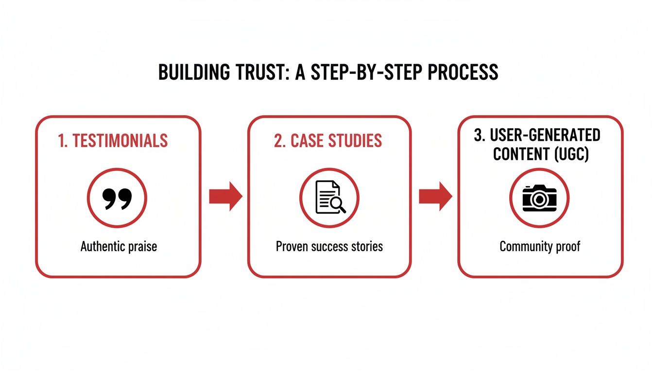
The most persuasive sales pitch will always come from your satisfied customers. Authentic testimonials and reviews are your front-line defense against user skepticism.
However, a generic, anonymous quote is no longer effective. “Great service!” from “John D.” is practically invisible to a modern consumer. To make testimonials work, they need credibility and specificity.
- Put a Face to the Name: Including a real headshot and full name (and company/title, for B2B) makes a review instantly more human and believable.
- Get Specific and Outcome-Oriented: A review that states, “Their accounting software saved our team 10 hours a week and reduced invoicing errors by 90%,” is infinitely more powerful than vague praise.
- Embrace Video Testimonials: A short video clip of a customer sharing their story is the gold standard of social proof. It’s personal, engaging, and extremely difficult to fake.
Expert Tip: Don’t quarantine your best testimonials on a dedicated page that few will visit. Strategically deploy them where they will have the most impact. Place a glowing review about product quality directly on a product page. Position a powerful success story right next to your “Request a Quote” form. Give users that final nudge of confidence at the critical moment of decision.
The Power of Authentic User-Generated Content
User-Generated Content (UGC) is social proof in its most authentic form. It’s your product being used by real people in their real lives. Think customer photos on Instagram, unboxing videos on YouTube, or a detailed review on a third-party site like G2 or Capterra.
This raw, unfiltered content is often perceived as far more trustworthy than your own polished marketing materials.
The data confirms this. An analysis of 1,200 websites revealed that pages featuring UGC had a baseline conversion rate of 3.2%. But when visitors actively scrolled through that UGC, the rate jumped an additional 3.8%.
Even more compelling? Users who interacted with the UGC (e.g., liking, sharing) were 102% more likely to convert. You can dig into the full findings on UGC and conversion rates at Wordstream.com.
Non-Negotiable Foundational Trust Signals
Beyond customer validation, your site itself must communicate professionalism and security. These foundational trust signals work in the background to reassure visitors at every step.
Think of them as the digital equivalent of a clean storefront, professional signage, and a business license hanging on the wall. They aren’t flashy, but their absence is a major red flag.
Essential Trust-Building Elements
| Trust Signal | Why It’s Critical | Best Practice Example |
|---|---|---|
| SSL Certificate (HTTPS) | The padlock icon in the browser bar signals that the connection is encrypted and secure. It’s non-negotiable for any site, especially those with forms or e-commerce. | Your URL must begin with https://. Modern browsers prominently display a “Not Secure” warning on http:// sites, which is a massive trust-killer. |
| Accessible Privacy Policy | This demonstrates that you are a legitimate business that respects user data and complies with regulations like GDPR and CCPA. | Include a clear link to your Privacy Policy in your website’s footer, making it accessible from every page. |
| Prominent Contact Info | A real phone number, email address, and physical address prove you are an accountable, real-world entity, not an anonymous online operation. | Display your primary contact information in the header or footer, and create a comprehensive “Contact Us” page with a map and multiple contact methods. |
By weaving these layers of trust throughout your site—from customer testimonials to technical security—you create an environment where visitors feel safe and confident enough to take action. This is how you turn a hesitant browser into a loyal customer.
How to Test and Analyze Your Way to Higher Conversions

Conversion Rate Optimization is not a one-time project; it’s a disciplined, continuous process of improvement. You don’t just implement a new design and hope for better results. Professionals build a system of methodical testing and data analysis that transforms guesswork into a reliable engine for business growth.
This is the phase where you stop making decisions based on opinion or intuition and start letting your user data guide your strategy. By systematically testing changes and measuring their real-world impact, you can build a website that consistently converts more of your hard-earned traffic into customers.
Finding Your Optimization Opportunities
Before you can test anything, you must know where to focus your efforts. It’s inefficient to optimize a low-traffic blog post. The key is to identify your “leverage pages”—those with high traffic but a disappointing conversion rate. These represent your greatest opportunities for immediate impact.
You can uncover these pages using free tools like Google Analytics. Navigate to your page reports and look for the intersection of two key metrics:
- High Pageviews: These pages are receiving the most traffic.
- High Exit Rate: A large percentage of visitors are leaving your site from this page.
A page with both high traffic and a high exit rate is a critical leak in your conversion funnel. It means you’re successfully attracting visitors to the page, but something there is failing to convince them to take the next step. This is precisely where you should run your first tests for maximum ROI.
By analyzing these reports, you can pinpoint the exact pages in your funnel that are costing you money and require immediate optimization.
Building a Testable Hypothesis
Once you’ve identified a problem page, the next step is to formulate a hypothesis. A strong hypothesis isn’t a random guess; it’s a clear, testable statement that outlines the proposed change, the expected outcome, and the reasoning behind it, based on your initial audit and data analysis.
A solid hypothesis follows this framework: “By changing [Independent Variable], I predict [Dependent Variable] will improve, because [Rationale].”
For example, let’s say your main service page has a high exit rate. Your hypothesis might be:
“By changing the headline from ‘Our Expert Services’ to ‘Get a Flawless New Roof in 3 Days—Guaranteed,’ I predict our quote requests will increase by 15% because the new headline is specific, benefit-driven, and includes a trust-building guarantee.”
This provides a clear goal and a specific metric to track. It’s measurable, falsifiable, and directly tied to a business outcome—the hallmark of a professional CRO program. The process of continually tracking these metrics is central to performance monitoring and website optimization.
Prioritizing Your Tests for Maximum Impact
You will likely generate numerous testing ideas, but you can’t implement them all at once. Effective prioritization is critical. A widely used framework for this is the PIE model, which scores each test idea on three criteria:
- Potential: How much improvement do you realistically anticipate from this change? A headline change has higher potential than a footer link change.
- Importance: How valuable is the traffic to this page? A change on your checkout page is far more important than one on your “About Us” page.
- Ease: How quickly and easily can this test be implemented by your team? This considers both technical and operational resources.
By scoring each idea on these three factors, you can create a ranked backlog that ensures you’re always dedicating resources to the tests most likely to deliver a meaningful impact on your business.
Understanding Your A/B Test Results
This is the most crucial concept in A/B testing: there is no such thing as a “failed” test. If your new version (the “variation”) does not outperform the original (the “control”), you have still gained an invaluable insight. You have learned what doesn’t work for your audience.
These learnings are just as important as the wins. A “losing” test prevents you from deploying a permanent, site-wide change that would have decreased your overall conversion rate. It’s a vital part of the scientific process that refines your understanding of customer behavior over time.
Personalization powered by AI is making this process even more effective. With the CRO software market expected to grow from $3.01B in 2019 to $5.07B by 2025, adoption is key to staying competitive. AI engines can tailor experiences in real-time, helping stabilize global e-commerce averages around 2.5-3%.
Frequently Asked Questions (FAQs)
What is A/B testing?
A/B testing, also known as split testing, is a controlled experiment used to compare two versions of a webpage to determine which one performs better. You show the original version (Control or “A”) to one segment of your audience and a modified version (Variation or “B”) to another. You then measure which version leads to a higher conversion rate for a specific goal. This data-driven approach removes guesswork from website optimization.
How long should I run an A/B test?
The duration of an A/B test depends primarily on your website’s traffic volume and the original conversion rate of the page. The goal is to run the test long enough to reach “statistical significance” (typically 95% confidence), which means the results are highly unlikely to be due to random chance. For most small to medium-sized businesses, this often requires running a test for at least one to two full business cycles (e.g., two weeks) to account for daily and weekly fluctuations in user behavior.
What tools can I use for A/B testing?
There is a wide range of powerful A/B testing tools available. Google Optimize is a popular free option that integrates seamlessly with Google Analytics, making it an excellent starting point. For businesses looking for more advanced features like multivariate testing, server-side testing, and detailed analytics, premium platforms like VWO and Optimizely are industry leaders.
What is a good website conversion rate?
This is one of the most common and nuanced questions in digital marketing. There is no universal “good” conversion rate. It is entirely relative to your industry, business model, price point, and traffic source. For example, a B2B company selling enterprise software might be thrilled with a 1% lead conversion rate, while an e-commerce store selling low-cost consumer goods may need a 5% conversion rate to be profitable. The best benchmark is your own historical performance. Focus on continuous, incremental improvement over chasing arbitrary industry averages.
What should I optimize first on my website?
To achieve the quickest and most significant impact (the “low-hanging fruit”), start by optimizing pages that have a combination of high traffic and high strategic value but are underperforming. Use your analytics to identify your most-visited landing pages, product pages, or the initial step of your checkout/lead form. A small improvement on a high-traffic page will yield a much larger absolute gain in conversions than a large improvement on a page that few people see. Common first tests often involve clarifying the main headline and value proposition, or simplifying the primary call-to-action. For a deeper dive, check out this a complete guide to improving website conversion rates.
At Websites USA, we understand that turning clicks into customers is a strategic blend of art and science. If you’re ready to move beyond guesswork and build a website that serves as a powerful engine for business growth, our team is here to help. We combine data-driven strategy with expert design and development to create online experiences that deliver measurable results.
Get Your Free Website Analysis and Take the First Step Towards Higher Conversions


